Preview
Brief
C & C Auto Service
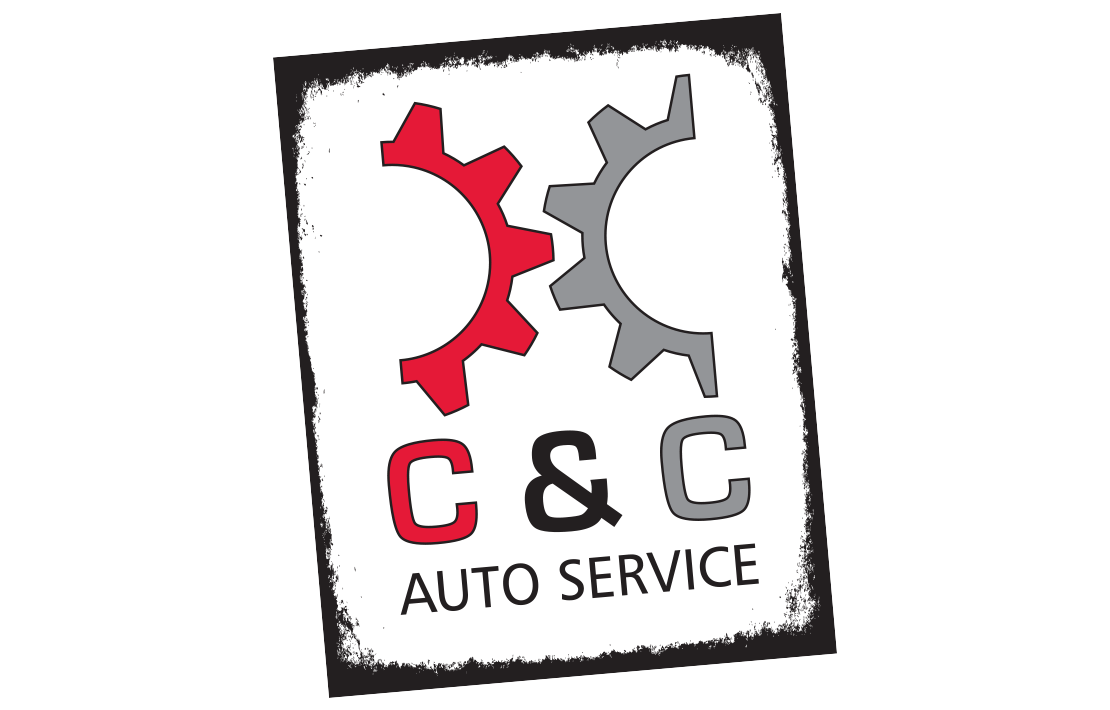
C & C Auto Service was a start-up auto mechanic right near the North Carolina State University (NCSU) campus. By experimenting with the shape of gears and the double 'C' in the company name, Studio RTP was able to design a logo that represents the nature of work provided by C & C Auto Service. Enclosing the design in a 'grunge-style' border also helped to keep the elements from floating on their own. The color red sparks certain emotions where marketing is concerned, such as the sense of urgency, especially for impulsive shoppers. When you're late for class and your car is broke down, needless to say there is a sense of urgency and your buying decisions may become a bit impulsive.
Services Provided:
- Logo/Brand Design
Date:
Jul 25, 14To view the full list of all our different project, please select an option below:
Back to Latest Projects Website Design Brand/Logo Design Print Design Illustration and Fine Arts
