Preview
Brief
Arcadia Consulting Engineers
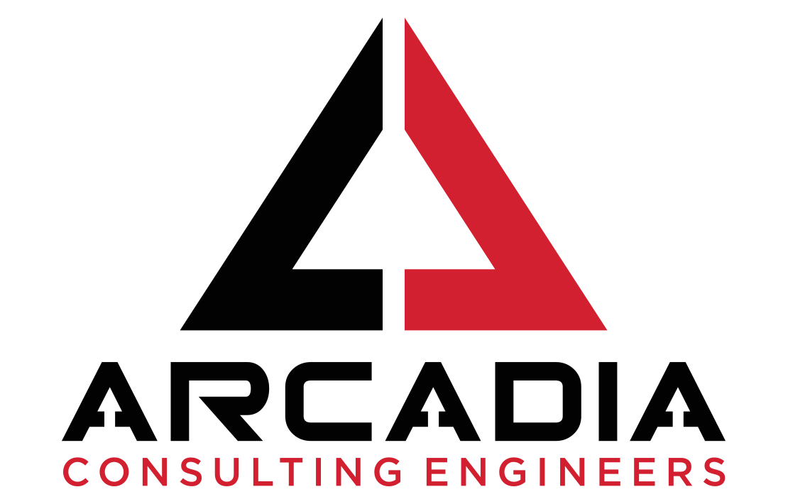
Studio RTP designed the Arcadia Consulting Engineers logo using representative, yet abstract shapes to accomplish the shape of the letter 'A' and then carrying the unique quality of the negative space down to the typography of the name 'Arcadia'. Using the colors red and black, the logo triggers a sense of class and creates a sense of professionalism, passion and intensity. There is a reason that companies like Ace Hardware, Adobe, Coca-Cola, Toyota and others use the color red as the predominant color in their logo.
Services Provided:
- Logo/Brand Design
Date:
Jan 05, 17To view the full list of all our different project, please select an option below:
Back to Latest Projects Website Design Brand/Logo Design Print Design Illustration and Fine Arts
